


A Note on Methods
In any study, questions arise over the methods used and decisions made; we present answers to some of those questions here so that readers can assess the trustworthiness of the findings.
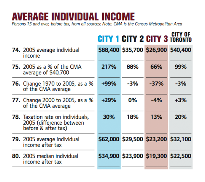
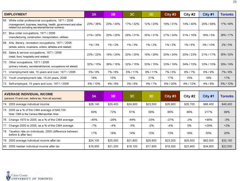
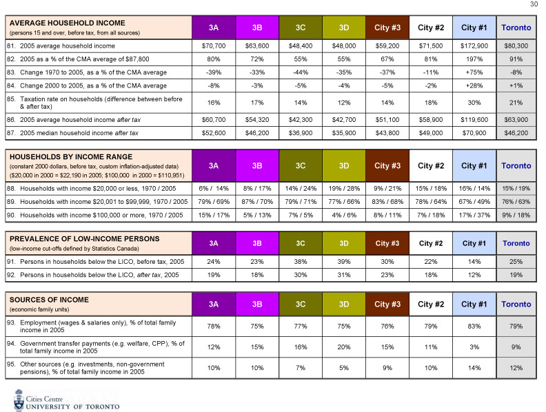
WHY USE INDIVIDUAL INCOME INSTEAD OF EMPLOYMENT INCOME OR HOUSEHOLD INCOME?
The Canadian census provides data on income in many forms, such as individual, employment, household, and family income, and breaks the data down into different subsets of the population, such as men and women, single parents and two-parent families. We used average rather than median income, because average income is provided by Statistics Canada for the entire 35-year period. In addition, for the purposes of this research, average income is a better measure than median income because it is more sensitive to the presence of very low- or very high-income persons in a census tract.
Individual income is the census category for income from all sources. Employment income includes only the wage income of individuals, and excludes people on pensions or social assistance and people who receive investment income. We used individual income rather than employment income, because it is more comprehensive (including pension, social assistance, investment and employment income) and includes more people (everybody who reports income and not just those with employment income).
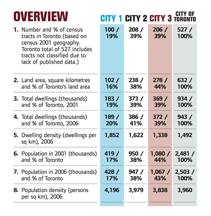
When we carried out the analysis using employment income, City #1 and City #2 were slightly larger (23% and 42% of the 514 census tracts with data) and City #3 was smaller (36%) than with individual income.
We also tested the results using household income. In this analysis, City #1 and City #2 were slightly smaller (15% and 39% respectively) and City #3 was larger (46%) than with individual income. This difference is due to the differences in household size between these areas (see Families & Households section in Table 1).
There is, in short, no significant difference in the trends, whether we use employment, household, or ndividual income. All census tracts have some households with a few adults employed and some with only one adult. All census tracts have people who are temporarily unemployed or on social assistance or on low etirement incomes or have investment income in addition to their wages. Employment income tends to show slightly more census tracts near the middle if we use the same five income categories. Household income and individual income show very similar patterns for high and middle incomes. There is a slight difference in the results for low and very low incomes. An analysis by household income shows slightly more very low-income census tracts in 2005, whereas that for individual income shows slightly more low-income census tracts.
There is, therefore, no universal “best way” to measure neighbourhood income change. Furthermore, any factors that might bias the results from any one source of data tend to balance themselves out, given the large population being studied (2.5 million people in the city and an additional 2.6 million in the outer suburbs).
We also used the CMA average income rather than the City average, because the labour and housing markets of the city and its outer suburbs are connected. Many people living in Toronto earn their income from jobs in the suburban municipalities and vice versa. Also, using the CMA average as our benchmark allows us to compare Toronto neighbourhoods with neighbourhoods in the outer suburbs.
WHAT CENSUS TRACT GEOGRAPHY DID WE USE AND HOW DO WE RECONCILE CHANGES IN THE NUMBER AND SPATIAL DEFINITION OF CENSUS TRACTS OVER TIME?
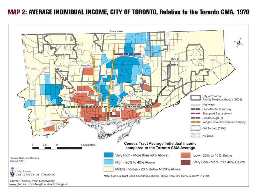
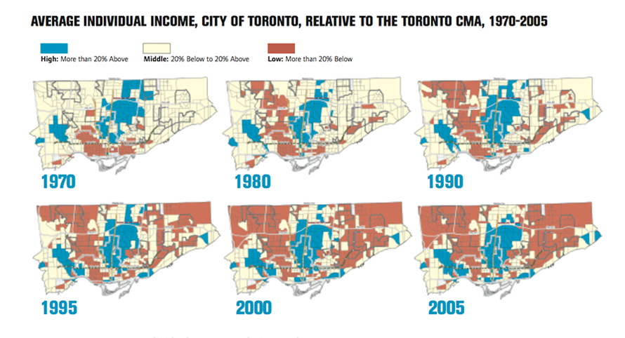
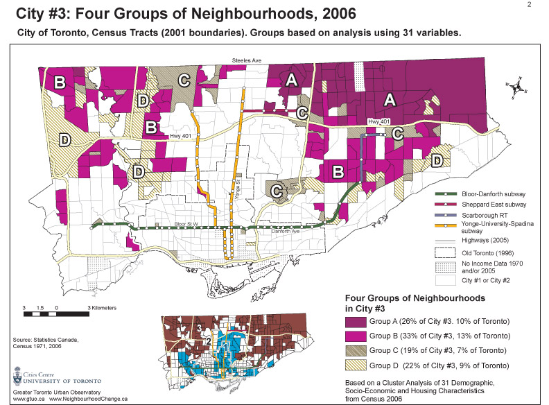
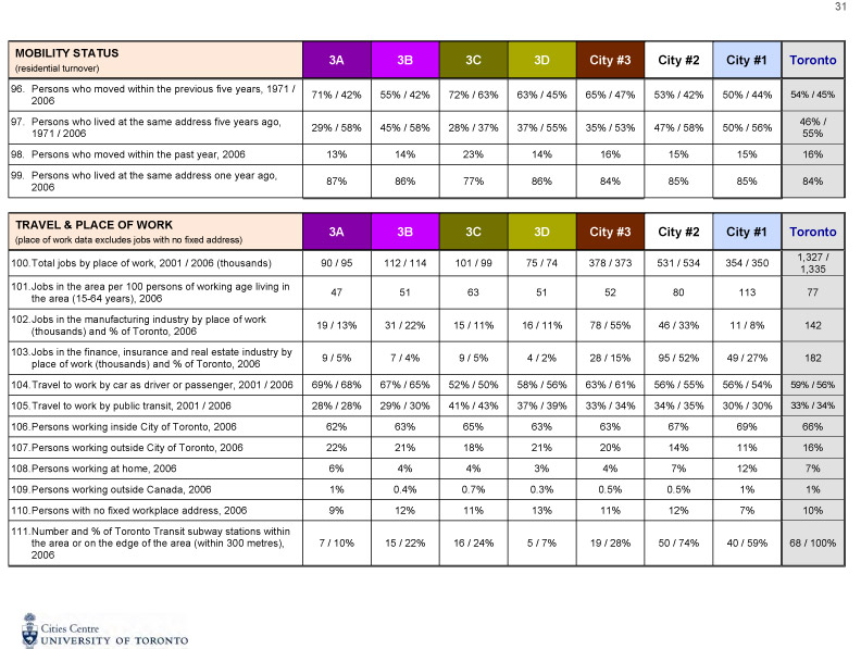
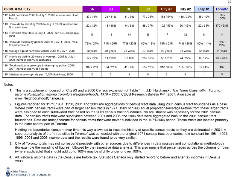
The maps in this publication are based on the 2001 census tract geography, the same geography used in Research Bulletin 41 (2007), The Three Cities Within Toronto: Income Polarization among Toronto’s Neighbourhoods, 1970-2000.
As the City of Toronto increased in population, especially in the suburbs, Statistics Canada divided several 1971 tracts into two or more tracts over the years to 2001. This alteration required some operational decisions on how to handle the 1971 income data. For the 1971 census tracts that were subdivided between 1971 and 2001, we assigned the same average income for 1970 to each of these tracts. That is, if a 1971 census tract was subdivided into two tracts by 2001, each of these tracts was assigned the same income for 1971.
For the 2006 analysis, incomes for the few tracts that were subdivided between 2001 and 2006 were averaged and assigned to the appropriate 2001 tract.
This approach introduces a small amount of imprecision to the analysis, particularly in the more recently developed northern parts of the City, but does not affect the overall trends, since most of the City was built up by 1970. The major advantage of our method is the creation of more detailed maps of change patterns, because one-to-one census tract comparisons between 1970 average income and more recent census years are possible. We did not map census tract changes using this method for the “905 region” because much of this area was undeveloped in 1970.
HOW DO WE COMPARE CENSUS TRACT CHANGES OVER TIME?
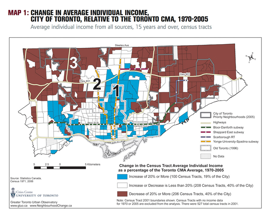
We calculated the extent to which the average individual income of people 15 years and older in each census tract in 1970 and in 2005 was above or below the average individual income for the entire Toronto Census Metropolitan Area (CMA). Specifically, we divided the average income for the census tract by the average Toronto CMA income for each year thereby obtaining a ratio for each year, 1970 and 2005. Finally, for each census tract we calculated the percentage increase or decrease in the two ratios.
We examined the percentage increase or decrease in the 1970 and 2005 income ratios rather than straight dollar-to-dollar comparisons between 1970 and 2000 for two reasons.
First, the cost of living in Toronto has increased over time, making a $10,000 income in 1970, for example, worth much more than $10,000 in 2005.
Second, direct dollar comparisons cannot tell us how far up or down the income ladder a neighbourhood is located and the size of the gap between different income levels. Any income figure is meaningless on its own
unless one has a benchmark that indicates whether it is high, middle, or low.
We used the average income for the Toronto CMA for an income benchmark because it takes into account the rapid growth in jobs and population in the surrounding outer suburbs — the “905 region” — which now has a slightly larger population than the City. Many people live in the area surrounding the City but earn their income from employers inside the City and vice versa. In other words, the labour market and the housing market are larger than the City of Toronto itself.
WHAT CATEGORIES DO WE USE TO MAP CHANGES IN AVERAGE INDIVIDUAL INCOME?
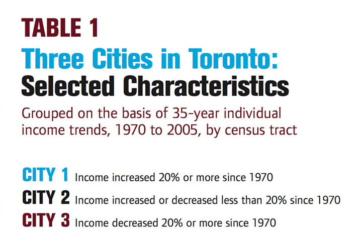
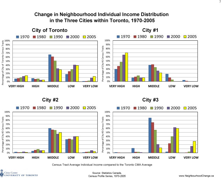
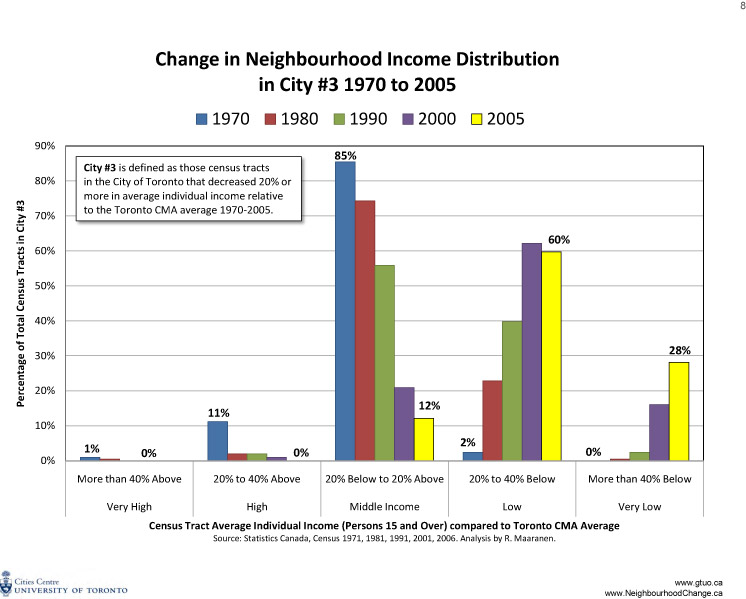
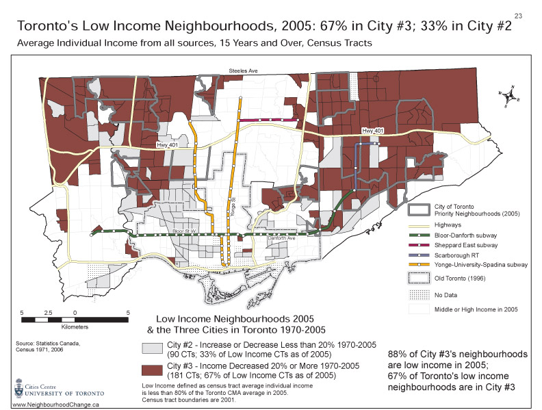
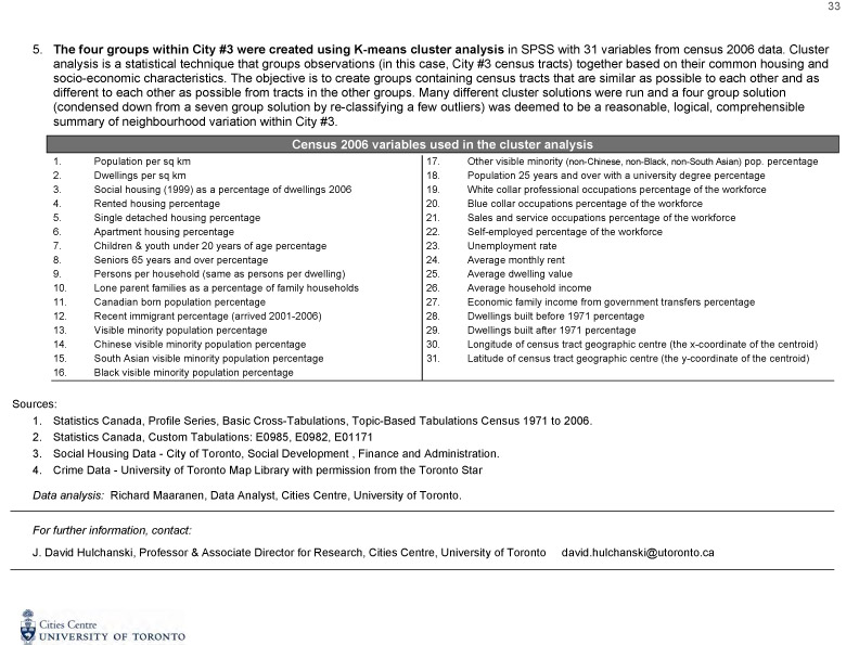
For mapping changes in average individual income (Map 1) we divided the percentage increase or decrease in the 1970 and 2005 income ratios into three categories: (1) City #1: an increase of 20% or more, (2) City #2: an increase or decrease of less than 20%, and (3) City #3: a decrease of 20% or more. While these are arbitrary boundaries, we did experiment with finer divisions of the data. Overall, the three-group categorization is a reasonable compromise and a useful public policy tool. In order to explore the trends in City #3, we have also developed a more detailed profile of City #3 as a supplement to this publication.