


09. “Reading” maps carefully: The location of Toronto’s lower income neighbourhoods
The dramatic increase in the number of lower-income neighbourhoods in Toronto has implications for the provision of many government and community services.
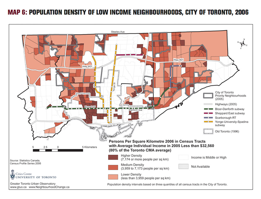
Maps are helpful, but can be misleading if what they depict is not fully understood. Map 6, showing the population density of Toronto’s low-income neighbourhoods, is important for people engaged in the planning, funding, and delivery of social and community services.
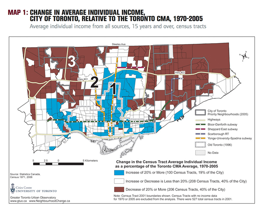
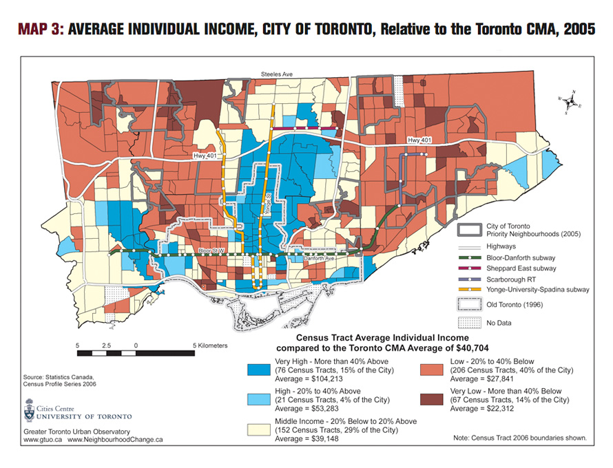
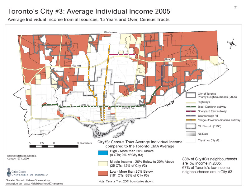
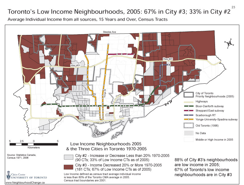
To identify the lower-income neighbourhoods in the most recent census, we need to look at Map 3. This map shows the average individual income of each census tract for one year, 2005. It is a map showing high-, middle- and low-income areas of the city. By itself, however, it can be misleading because census tracts are not all the same size geographically, even though the population of each census tract is approximately the same (averaging 4,700 in Toronto).
Map 6 corrects for the mismatch between the different geographic size of census tracts and the fact that census tracts have approximately similar sized populations. It shows only the lower income census tracts on the basis of their population density. Thus, even though most of the neighbourhoods in northeast and northwest Toronto have, on average, low-income populations, much of those areas are lower density — except for the clusters of high-rise residential towers. Areas south of the Danforth and areas west of University Ave. (north and south of Bloor St.) are Toronto’s traditional low-income “inner city” neighbourhoods. They continue to be high-density concentrations of lowerincome people in 2006, even though there is some gentrification occurring in and around those areas.
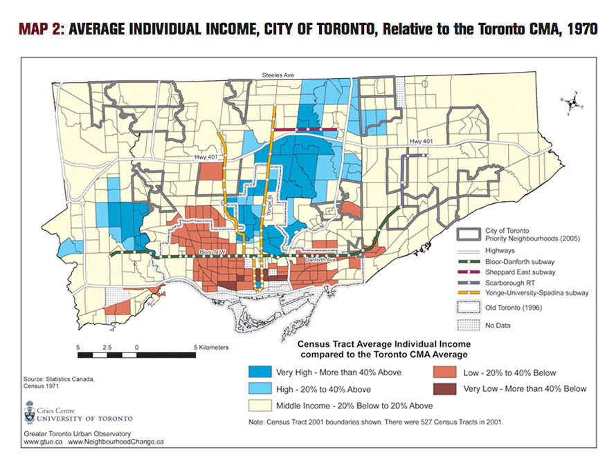
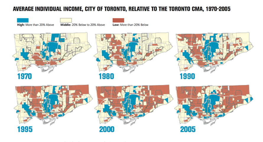
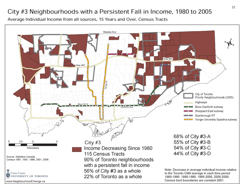
Map 1 in this report, in contrast, takes two points in time, 1970 and 2005. It maps trends — those neighbourhoods that have been trending upward in average individual income (coloured blue) or trending downward (coloured brown) over those 35 years. This important and dramatic map of trends, however, is not a map of low-income or poverty neighbourhoods. Most but not all of the neighbourhoods trending downward are indeed lower-income. However, many of the neighbourhoods that are not trending up or down (the white areas on Map 1, which is City #2), are low-income (as Maps 3 and 6 indicate).
It must be noted that Map 6 is not a perfect representation of the population density of Toronto’s low-income neighbourhoods. This is because the map is based on gross population densities rather than net densities, or in other words persons per square kilometre of total land area rather than residential land area. Gross population densities are calculated by dividing the population of a census tract by the total land area of that tract, while net densities are determined by dividing the population of the tract by its residential area. The difference in methods can give dramatically different results for census tracts with a considerable amount of non-residential land use (e.g. industrial, commercial, airports, open space, farmland). In that case, net densities will be substantially higher than gross densities. Thus, census tracts in the northeast and northwest of Toronto, which are largely non-residential, exhibit much lower densities in Map 6 than they would if net densities had been used. Unfortunately, land use information by census tract is not readily available, so net densities cannot be easily calculated.

Map 6, PDF