04. How have the three groups of neighbourhoods changed?
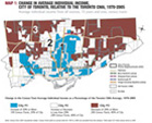
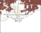
Maps 2 and 3 provide the same data used in Map 1 but for two specific years, 1970 and 2005, rather than the summary 35-year trend.
The maps for each specific year indicate in light yellow neighbourhoods that were “middle income,” that is, defined as having an average individual income less than 20% above or below the Toronto CMA average for that year. In 1970 (Map 2), average individual incomes in 66% of the city’s census tracts (341 census tracts), were close to the average income for the Toronto area.
By 2005 (Map 3) the proportion of middle-income neighbourhoods had fallen to 29% of the city’s census tracts (152 census tracts). Meanwhile, the proportion of low- and very lowincome neighbourhoods increased from 19% to 53%, and the proportion of high- and very high-income neighbourhoods increased from 15% to 19%.
The number of middle-income neighbourhoods in the city of Toronto has declined
Maps 1, 2, and 3 indicate the location of the neighbourhoods in particular income groups. Figure 1 provides a 1970 to 2005 summary of the change in the number of neighbourhoods in each income group, together with a straight-line projection to the year 2025. The projection assumes the current trends continue.
In Figure 1 we see what has happened to Toronto’s middleincome neighbourhoods — those with average incomes within 20% above or below the CMA average. There has been a 56% drop in the proportion of neighbourhoods with middle incomes between 1970 and 2005 (shown as the middle group of bars, which dropped from 66% to 29%). Most of this loss in the middle group can be accounted for by increases in the number of low-income and very low-income neighbourhoods, which increased from 19% of the city to 53% of the city over the 35-year period.
The poorest and wealthiest neighbourhoods have something in common: both were more numerous in 2005 than in 1970. The poorest category in Figure 1 — those with average incomes of less than 60% of the CMA average — increased from 1% to 9% of the city’s neighbourhoods. Similarly, the mirror opposite eighbourhoods — those with incomes greater than 40% of the CMA average — increased, from 7% of the city to 15%.
In short, the City of Toronto, over a 35-year period, ceased to be a city with a majority of neighbourhoods (66%) in which residents’ average incomes were near the middle and very few neighbourhoods (1%) had very poor residents. Middle-income neighbourhoods are now a minority and half of the city’s neighbourhoods are low-income when compared with the Toronto CMA average.
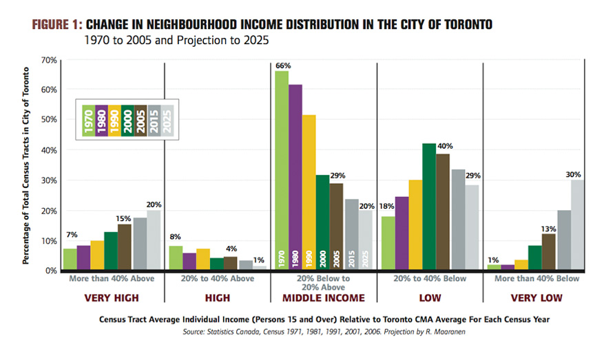
Figure 1, PDF
