03. Neighbourhood Polarization since 1970: Three distinct cities emerge in Toronto
The City of Toronto is huge: 632 square kilometres (244 square miles). With more than 2.5 million people living in its residential areas, a 20% increase since the early 1970s, the nature of its neighbourhoods has changed over time to reflect significant changes in the demographic characteristics and economic situation of their residents. Thirty-five years is an adequate period to examine the nature of change in neighbourhood characteristics and to identify trends.
Many of the questions asked in the 1971 census are still used in current census forms; therefore it is possible to analyse many aspects of neighbourhood change since that time. Thanks to a research grant from the Social Sciences and Humanities Research Council, a data analysis team at the University of Toronto’s Cities Centre (formerly the Centre for Urban and Community Studies) organized census data at the census-tract level for the Toronto CMA between 1971 and 2006. To avoid confusion with dates, note that incomes reported in the 1971 and 2006 censuses represent those of the preceding calendar years (1970 and 2005).
What have we found?
 Over the course of 35 years, the pattern of who lives where in Toronto on the basis of socio-economic characteristics has changed dramatically. There has been a sharp consolidation of three distinct groupings of neighbourhoods in the city. No matter what important indicator of socio-economic status is used, the results are very similar. In this report we use the starting point in any study of the socio-economic status of individuals — individual income.
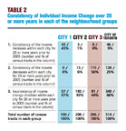
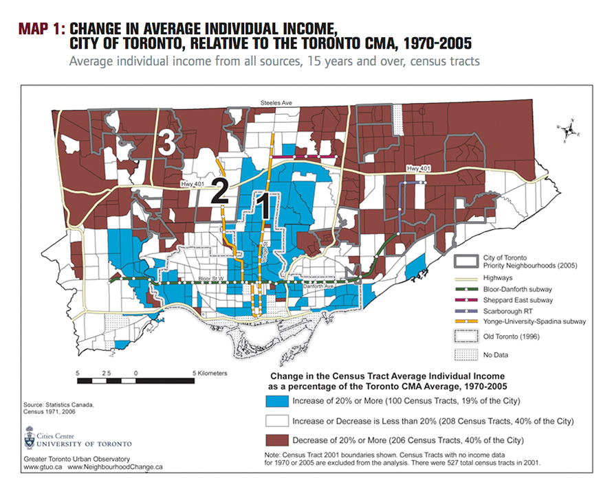
Using the 2001 census tract geography, we started by comparing the average individual income of people 15 years and older in each census tract in 1970 with the average individual income of people 15 years and older in the same census tracts in 2005 (see Map 1 and Table 1 and the note on methods at the end of this report for definitions). To control for inflation between the two years, we divided the average census tract income by the average income of the entire Toronto census metropolitan area (CMA) thereby obtaining a ratio for each year, 1970 and 2005. We did this for every census tract for 1970 and 2005 (as reported in the 1971 and 2006 censuses). Finally, we calculated the percentage increase or decrease in the two ratios.
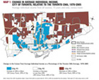
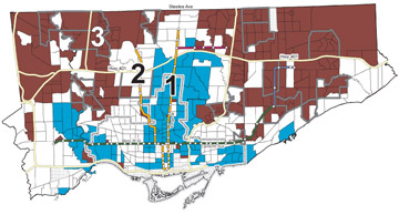
Three categories are shown in Map 1: (1) in City #1 individual incomes increased by 20% or more; (2) in City #2 incomes increased or decreased by less than 20%, and (3) in City #3 incomes decreased by 20% or more.
 (The note on methods at the end of this chapter indicates why we used average individual income instead of other income measures, why we used 2001 census tract boundaries for mapping, how we reconciled changes in the number and spatial definition of tracts over time, how we compared census tract changes over time, and what categories were used to map the percentage increase or decrease in the two ratios.)
Map 1 shows that, instead of a random pattern of neighbourhood change, Toronto’s neighbourhoods have begun to consolidate into three geographic groupings.
Neighbourhoods within which average individual incomes compared to the Toronto CMA average individual income increased by 20% or more between 1970 and 2005, that is, City #1, are shown in blue on Map 1. These neighbourhoods represent 19% of the city (100 census tracts, census 2001 boundaries) and are generally located near the centre of the city and close to the city’s two subway lines. This area includes some of the waterfront, much of the area south of Bloor Street and Danforth Avenue (where gentrification is taking place), and in central Etobicoke,
an area that from the time of its initial development has been an enclave of higher-income people.
The neighbourhoods that have changed very little, that is, in which the average income of individuals 15 years and over compared to the Toronto CMA average went up or down by less than 20%, have been left white on Map 1. This is City #2.
This area represents 39% of the city (208 of the 527 census tracts with census 2001 boundaries). For the most part, this group of neighbourhoods is in the middle, located between the other two groups of neighbourhoods.
Neighbourhoods within which average individual incomes decreased by 20% or more between 1970 and 2005 relative to the Toronto average individual income are shown as solid brown on Map 1. This is City #3. These neighbourhoods comprise about 39% of the city’s neighbourhoods (209 census tracts). They are mainly located in the northeast and northwest parts of the city outside the central corridor along Yonge Street and the Yonge Street subway.
The trends shown on Map 1 are both surprising and disturbing. Surprising, because 35 years is not a long time. Disturbing, because of the clear concentration of wealth and poverty that is emerging.
In the following section, we use individual maps for 1970 and 2005 (Maps 2 and 3), rather than the summary index of change in Map 1, to further explore the decline in “middleincome” neighbourhoods and the increase in “lower- and higher-income” areas.
Map 1, PDF
